
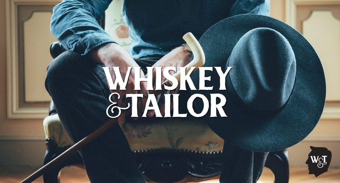
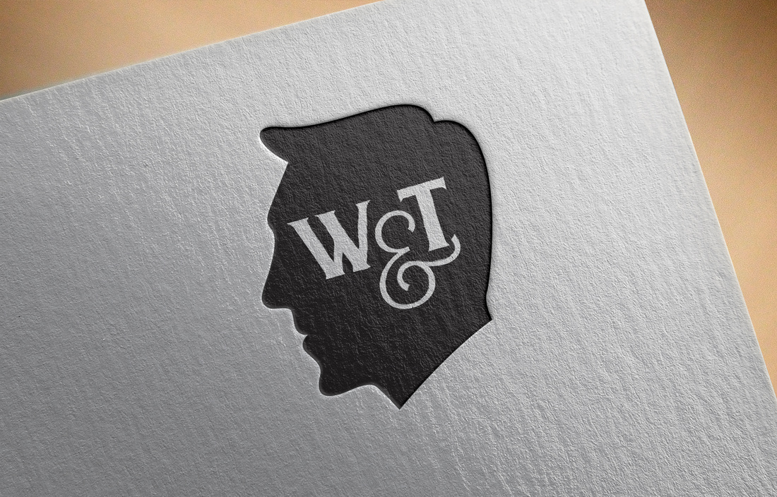
  I had so much fun designing the branding for this blog. The client didn't really specify what he wanted to see, so I thought "ok... if I were to have a gentlemen's blog... how would I design it?" This is exactly what I would want to see. Esp with the name... I think the typeface works perfectly. Including the icon. I'm proud of this design. I hope the client likes it as much as I do!
Photo: http://www.lifeofpix.com/gallery/look/  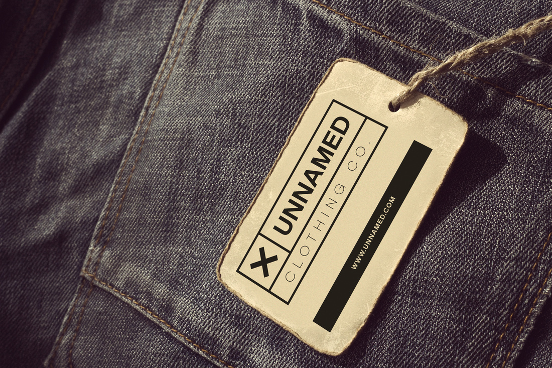 A little practice for my design concept skills. I found the client's brand name to be really interesting, but I didn't want to participate in the project because I have other projects to work on. So, I played around and wanted to see what I could come up with.
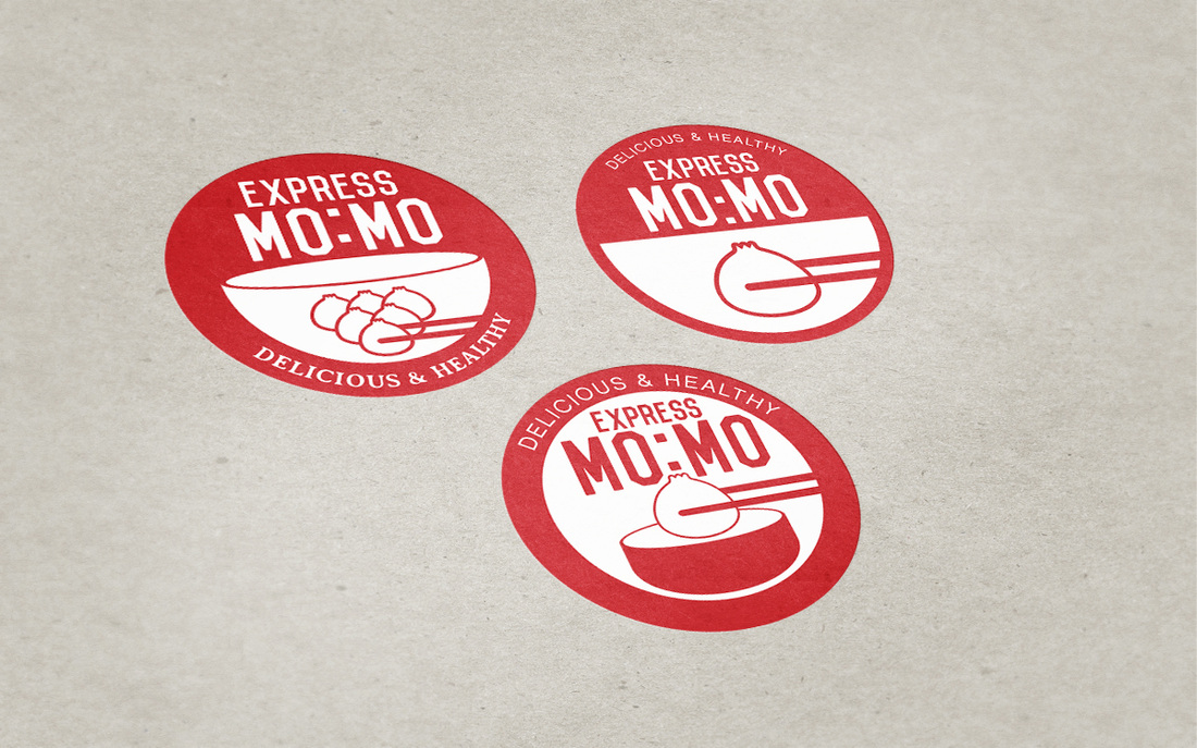 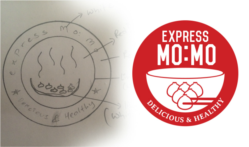 The client described what he wanted to see and even make a sketch of his idea. Honestly... i didn't really follow his idea. I followed the color scheme and concept, but I really didn't think the "thin line" for the bowl was working. He wanted to see a circular badge so I stuck with that, but I wanted the logo to be more direct and obvious. I had fun making this though! Haha. The red works and I really find those dumplings so cute! :P
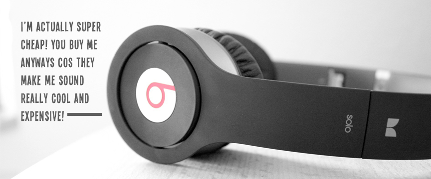 Yup, why Beats never impressed me. I couldn't believe something with such BAD quality costs $100+ and I honestly think people don't know how to tell the difference between good and bad products. As long as it's a "designer brand", they'll buy it.
I found these articles, all from respectable online sources:
It's a shame that people don't understand these things. Why spend so much money on something that distorts sound? Why do "musicians" fall for these schemes? It doesn't make sense to me why people spend so much money or find these stuff impressive when NO PART OF IT is actually impressive. It's really just the name! Next time you see Beats, tell yourself it costs $14 to make, but you're paying a whole lotta money for it. 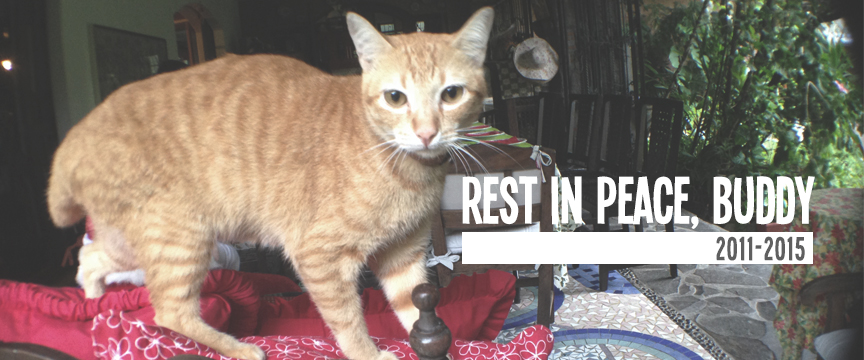
Tonight, my family and I lost our beloved cat, Joe.
The kind maid from next door rang our doorbell at 9pm to tell us she witnessed someone run over our cat who was crossing the street to come home. I'm so heartbroken and angry at the person who irresponsibly drove like a crazy person! KNOWING this is a secured village and MOST OF THE RESIDENTS are educated and sympathetic towards each other. What if there were kids?! I'm so hurt and sad because Joe was the one and only cat I ever loved. The same way I love my dogs. He brought me so much happiness whenever I'd come home... He was my midnight snack buddy in the kitchen. He loved purring and rubbing his back against me while I hung around downstairs. I loved carrying him around and playing with him... He was our family cat. The cat we adopted and even placed an orange collar around his neck, so people know he has an owner. We fed him everyday. He had a really awesome personality. I'm sorry you had to go that way, my baby... I will find the guy that did this to you and give him a piece of my mind. You meant so much to the whole family and I miss you already. I was looking for you earlier today... and I wish I saw you before you passed away. Rest in Peace, buddy. We will miss you.  Here's another logo design that I came up with. The client wanted to see a badge type logo and ya, I got super excited because I've been making some badges. I took the style of my own badges and this was the result. I'm really happy with it and hope the client likes it too!
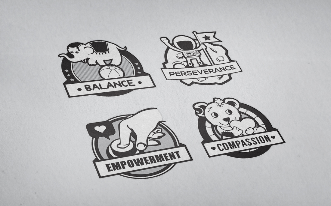 Here are some of the badges for the project!
As of now, there are a total of 12! I'm so excited to see the end product, when all of them are in one page! The whole infographic is still being made... the copy is being finalized and the images to be used are still being composed, BUT it will all be done soon and I really hope this whole idea will be done in 1 month cos i'm so excited for the next stage! I super love the direction and flow of this project because it's what i'm passionate about. If this circulates, my end goals is to set up AS MUCH outreach projects as I can. I feel like that's what I love doing. I find so much peace and I think that's my answer to everything. If the plan pushes forward, I'll get to do 2 things I love at the same time and that's so awesome! Good luck to me and everyone who is helping me on this project. 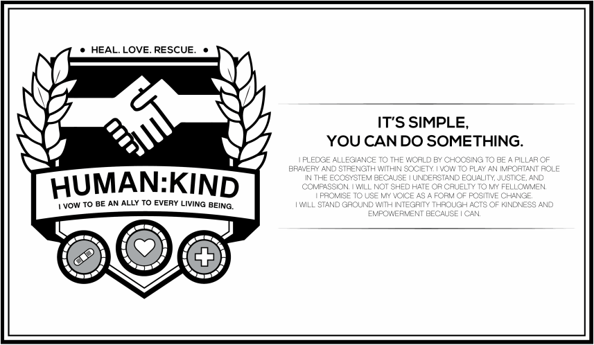 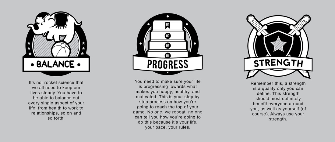  For the past 2 years, I've been talking about this "BIG" project and I'm happy to say, IT'S FINALLY COMING TO LIFE!!!! After 2 years of hardcore research and which direction, tone, and visual to take, here it is. The first snippet of The Patch-It Project.
Together with my friends and family, all of these stuffies were created. I've been working with a few people on this for the past 2 years. From writers, to visual soldiers, to illustrator enthusiasts, we joined our creative brains to come up with this project. So, what's the deal here?! I'm going to give you all a little back story. 2 years ago, I finally grew up and decided to let go of my bad habits. Why? I was hated on soooo hard. It was my first taste of pure hatred in my life and I made the decision to just man up and move on. It wasn't as easy as it sounds. It took A LOT of will power to not give in to the hate I wanted to give my haters. At the end, I figured it all out. This project is the result. I don't want to EVER focus on what almost killed me. I want to focus on what made me live again and why spend so much time researching and reading on how to do it? I'm going to give it to the world with this simple and visual heavy infographic project. It ALL STARTS with a promise to never be cruel. As this project kept going on, I got so sick and tired of all the pansy wansy negative things I see everyday. I had to take a stand in life because everyday, someone or something is misunderstood. My first case was Bullying. It moved on to Rape. Then Mental Disabilities. Differences. It kept piling up and then I finally heard/saw stories of people being way too hypocritical for their own good. I needed to do something. I asked my beautiful allies to help me compose all of this and my writers went down to business and I talked to a visual artists who gave me a piece of their mind. The direction, tone, and visual of this project got deeper. I wanted to stay far away from the formal "grown up" only for adults feel. This is going to be strong. young, and NOT as colorful because we're going to be hitting grave matters. From all the research, there's too much information that's not even important anymore. I couldn't believe people needed to go through all the junk to figure out what to do when you're in pain or hurt. I couldn't believe people couldn't see that a huge chunk relays on their level of humanity. The concept here is gathering an army of people to fight for Peace, Love, and Kindness. People need to engage now because it's time for it to happen MORE. We want to stand with the weak, especially the ones who can't find the words to speak. We want to make it clear that EVERY SINGLE PERSON DESERVES LOVE. And no... not boyfriend-girlfriend kind of love. REAL TRUE AND GENUINE LOVE. The kind that's going to shake you. We're getting geared up and this is only the beginning of it.
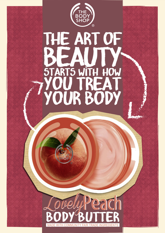
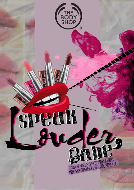
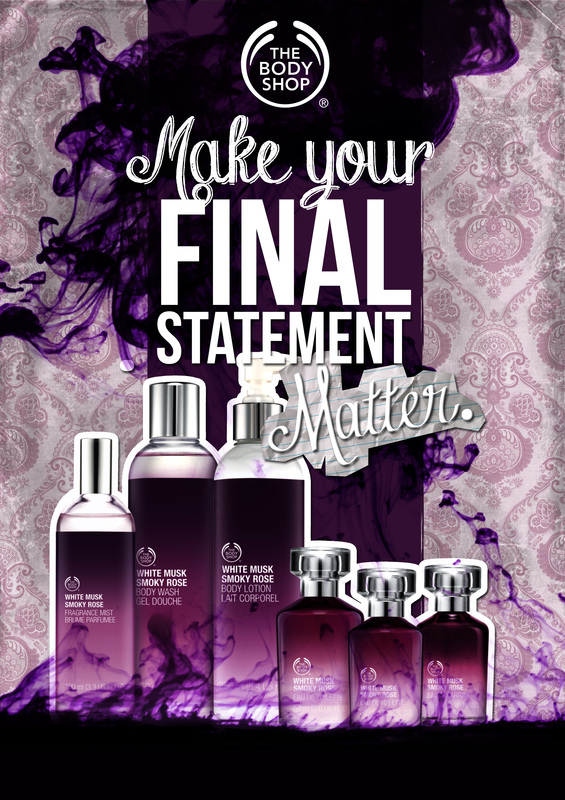
I took part in the D&AD awards last year (2014) and these were my entries for the Body Shop Campaign. I wanted to do something more vibrant and wild, instead of the usual look they always have. I wanted to speak to the younger audience and so this was what I came up with.
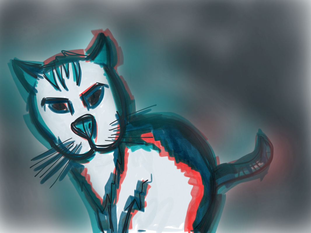 So, I was bored and I wanted to do something. I took out my stylus and started drawing a cat I saw in the church. Haha. Random.
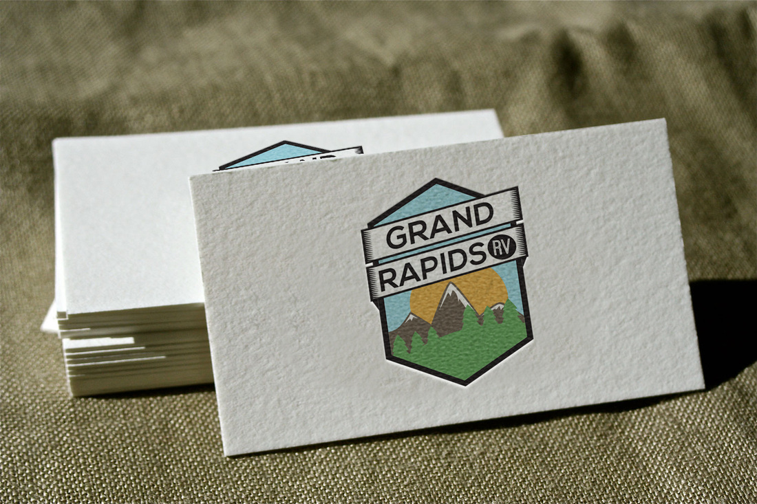
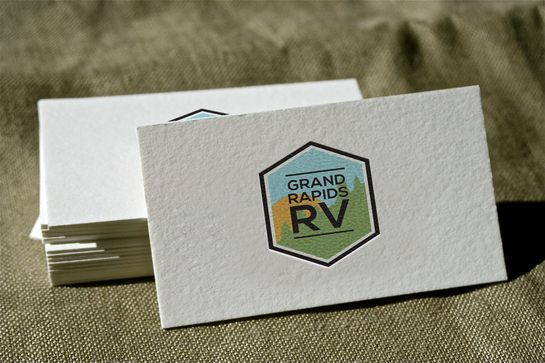
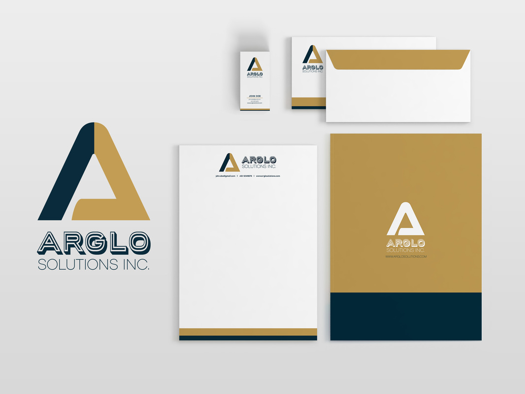 I had another great opportunity to work with a really awesome and nice IT company! A pair of brothers started an IT company to become help clients become a leader in retail innovative solutions. Innovation! Of course I was excited! I love companies or people that want to help others become better at what they do! Jack pot! They were super patient and kind to me, especially when I was having difficulty understanding what kind of logo they wanted to see.
It was a tight and long road to turn their concept into reality, but I'm very happy we were all able to communicate and work well together on this project. I'm honored to have been part of their progress and I hope their business is super duper successful! 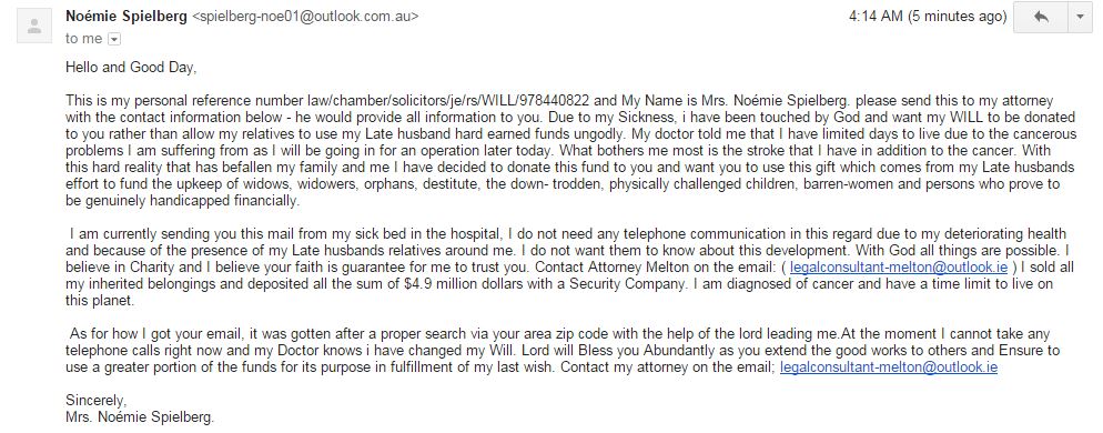 I saw this in my mail and it was too ridiculous! It sounds legit, but how'd it reach me, you know? I totally didn't believe it. I searched the email address on google and found the link below. I've been receiving so much scam mail recently and I'm pretty sure I'm not the only one. Please be careful! Don't give out any personal information to these emails!
I found this online and it helped me find out about scam emails: https://www.scamwarners.com/forum/viewtopic.php?f=7&p=232923
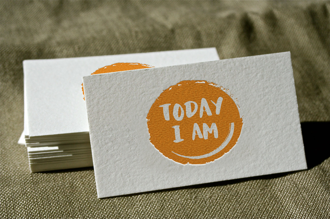
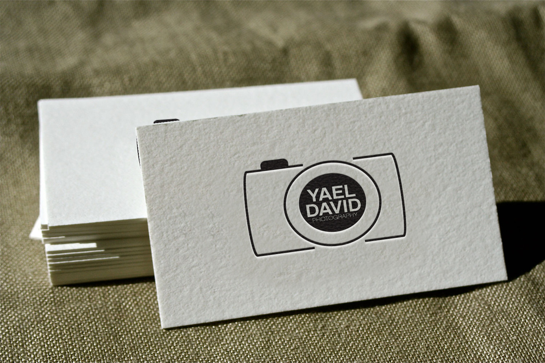
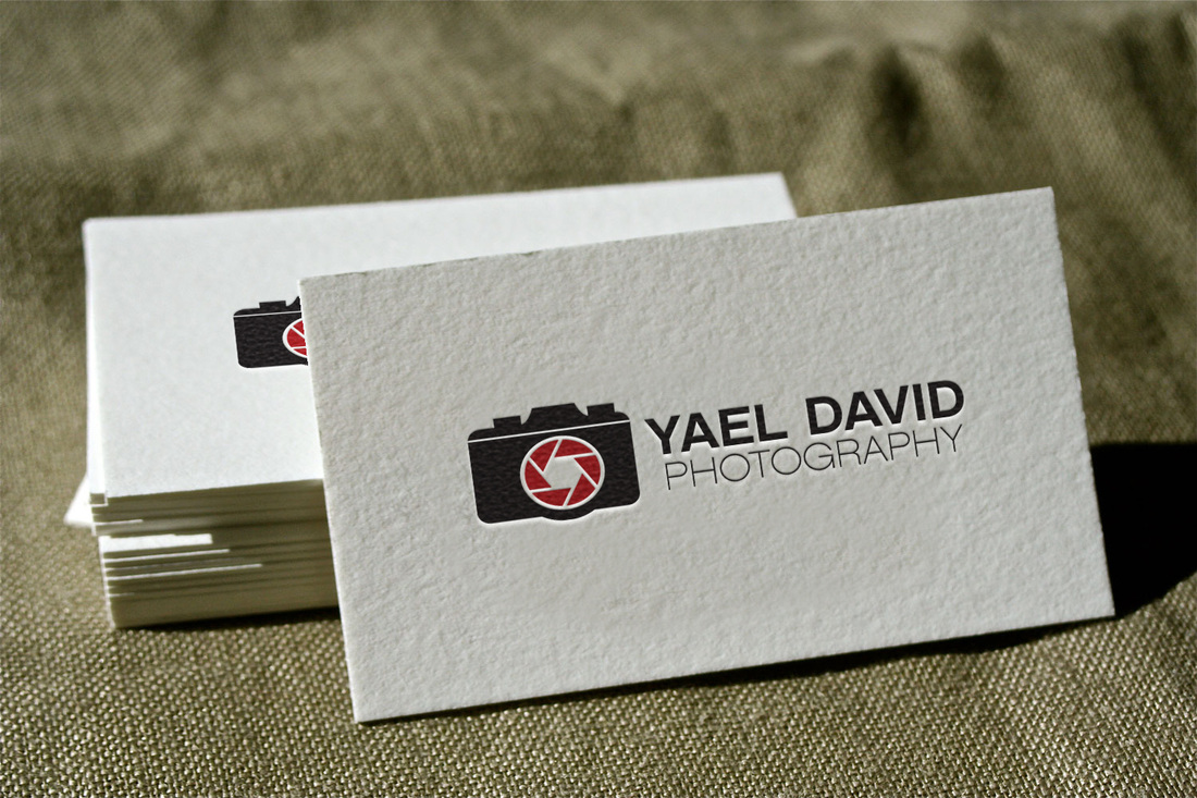
I totally believe going simple works... Sometimes, over-thinking a direction of a logo becomes super complicated. Haha.
|
Find Me:
Archives
October 2022
|


 RSS Feed
