
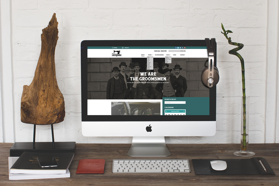
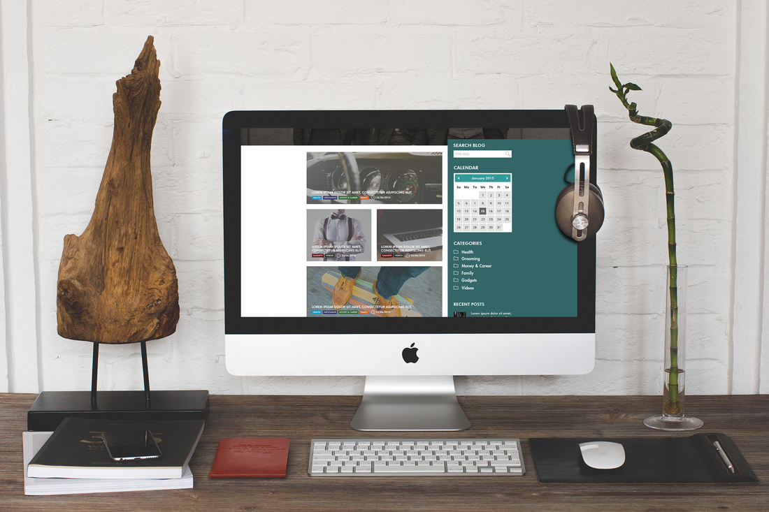
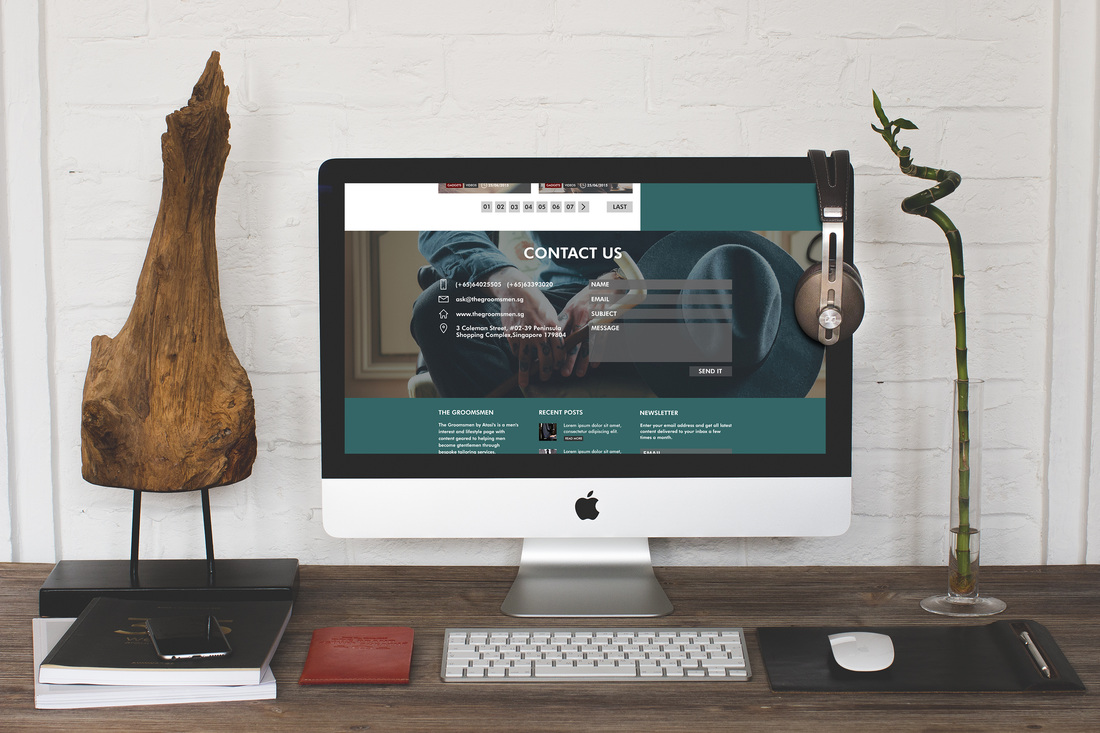
   The first time I was able to sit and talk to the guy who runs this show, I was hooked. The man behind all of this was so passionate about his idea, philosophy, and goal and I could really tell he had a vision for this website. It was so easy to work with him on this. The direction for this website was to be more bold and modern, even if the branding of the company was more vintage. There's this style going around today wherein designers are combining vintage with a modern touch so that's what I was going for here. I didn't want their blog/news website to look like every other men's lifestyle blog. While researching, I noticed most of these websites were either black, blue, and white. Even the layouts were similar! I took a risk and chose this color and layout instead. I wanted the website to be user-friendly. Some blog websites have too many ads and links, it drives me crazy! There's no flow into the design! I had to work on not doing that. This website will be up and running soon enough! I'm pretty excited to see the final design online! http://thegroomsmen.sg/
Comments are closed.
|
Find Me:
Archives
October 2022
|


 RSS Feed
