
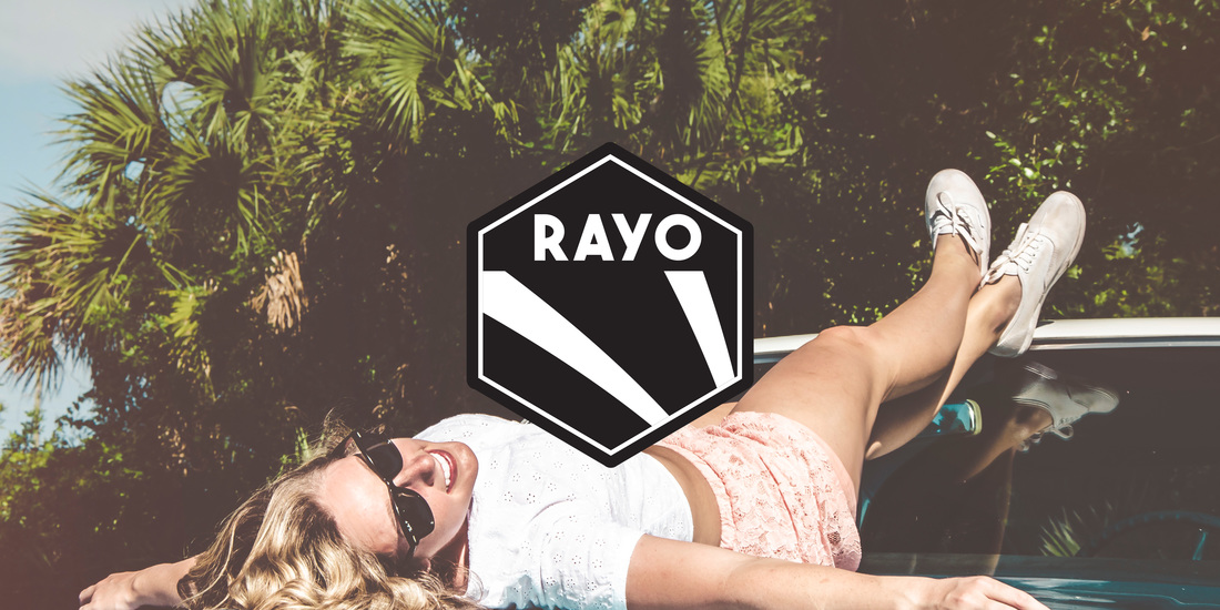
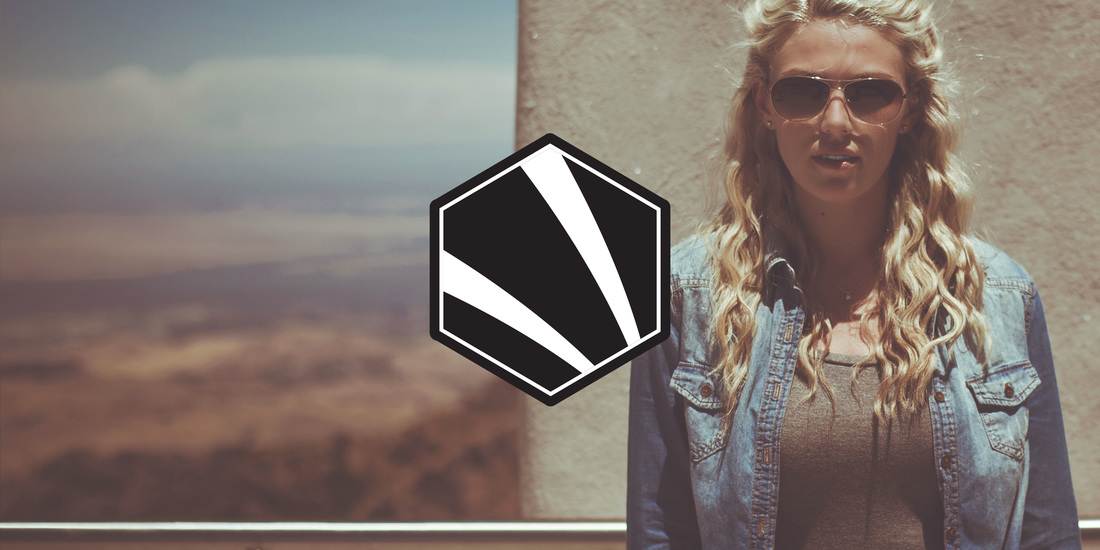
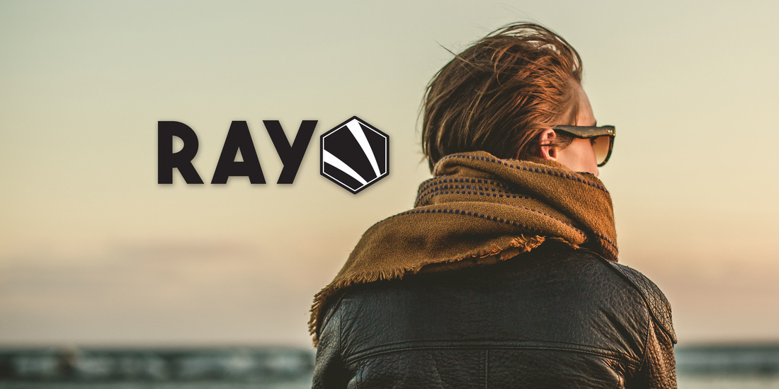
The client explained to me how RAYO came from the phrase, "Rays of the Sun". Their target market are women, but they didn't want to see a feminine logo. They wanted to see an emblem with a very bold font. Amongst all the other logos that I came up with, they chose this one. The next stage was coming up with the Brand Identity. The client explained to me the color and feel they wanted to see so I searched for Stock Photos that would represent their idea. Thankfully, I was able to understand it. This is in progress, but the logo is finalized. I'm happy about it because again, the clients were so nice and easy to work with. They gave me all the information I needed which made the creative process fast and easy to comprehend. I love clients like these! They make work fun!
Comments are closed.
|
Find Me:
Archives
October 2022
|


 RSS Feed
